Nordea master brand
Logotype
The Nordea logotype is a well-established wordmark, and a major representation of the Nordea brand to the world. It is a highly recognisable and valuable corporate asset that must be used consistently an in the proper, approved forms in all material.
Versions
The logotype is available in specific colour versions. To ensure consistency and full brand recognition across all platforms, these versions must always be used.
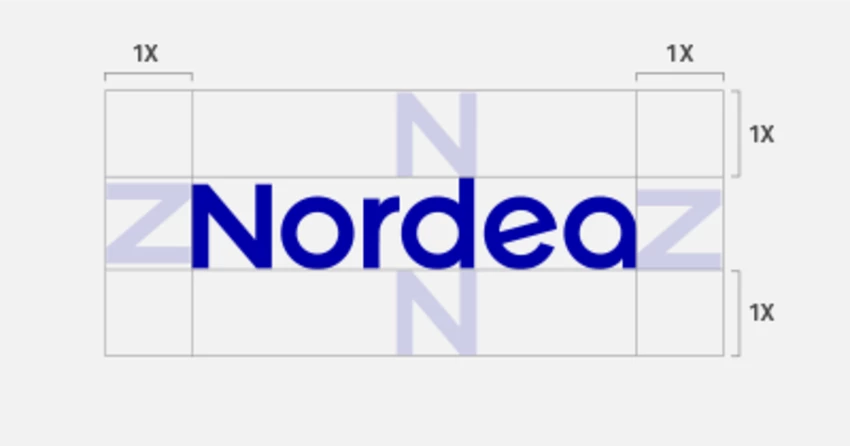
Clear space
The Nordea logotype should never be overcrowded by, or linked to, elements that reduce its legibility and visibility. In order to ensure it is full recognisable, the logotype should always be surrounded by an area of clear space into which no other graphic elements or objects intrude. The recommended area must never be reduced, but can be increased. The amount of clear space varies in direct proportion to the size of the logotype, with wordmark letter “N” as the definition of X.

Color codes
To ensure ultimate brand recognition through all platforms, the Nordea colors have been converted to match the different color systems. Below, all colors of the Nordea palette are represented with it’s specific code for each system.
PMS C: Dark Blue C (+V2)
PMS U: 286 U
CMYK: 100–80–0–0
RGB: R=0 G=0 B=160
HEX: #0000a0
NCS: S 3060-R80B
RAL: 5002 (Classic)
TCX: 19-4045
The logotype can also be reproduced in black and white but never in other colours.
